🚀 AllWDbook — From Idea to Launch
AllWDbook Build Journal
How We Designed the AllWDbook Visual Identity
How the black, night-navy, and orange identity was shaped to match AllWDbook's publishing tools and mobile-first experience.
When building AllWDbook, the visual identity was never just about choosing a logo and a set of attractive colors. The platform brings together very different digital publishing tools, so the real challenge was creating a visual system that could make all of them feel like parts of the same product.
That led to a dark foundation, deep night-navy surfaces, and orange as the primary accent for important actions and highlights. The goal was not decoration. It was to create an interface that could remain recognizable and readable even when screens contain inputs, data, results, and multiple tools.
As AllWDbook evolved, the identity also became connected to mobile usability, information hierarchy, buttons, cards, spacing, and bilingual presentation.
This article explains how those individual visual decisions gradually became a design system that supports the product itself rather than simply sitting on top of it.
Identity before decoration
When a product contains several technical tools, the interface can easily become a collection of unrelated cards and buttons. It was therefore important for every part of AllWDbook to share a recognizable visual language even when the underlying function was completely different.
Identity in this context means more than placing a logo at the top of a page. It includes the background, surfaces, borders, buttons, headings, alerts, and even the empty space between elements.
If a user moves from the Royalty Calculator to Keyword Research, the experience should still feel like the same product. That consistency reduces visual fragmentation and makes movement between tools more natural.
For that reason, visual identity became part of AllWDbook's structure rather than a separate styling step applied after development.
Why a dark foundation?
The dark interface became the visual foundation because it creates strong contrast between content and interactive elements. In tools filled with data, results, inputs, and cards, that foundation makes it possible to organize the screen without introducing too many competing colors.
Dark does not mean using one flat black everywhere. AllWDbook uses different dark and night-navy levels so a card can be separated from the page and a workspace can be separated from its surrounding surface without heavy borders.
Those layers become especially important on mobile. On a small screen, users need to understand where one area ends and another begins almost immediately.
The dark foundation therefore acts as a stable environment in which very different publishing tools can coexist.
Orange is more than a brand color
Orange has a practical job inside AllWDbook: it directs attention toward important elements. It appears in primary actions, selected borders, highlights, and visual signals that deserve priority.
Against a dark interface, orange can quickly indicate where the user should look or where an action begins.
The risk with any strong accent color is overuse. If every element becomes orange, the color stops communicating priority because everything starts competing for attention.
That is why the identity uses orange selectively, keeping it connected to action and emphasis rather than turning it into a general background color.
Using night navy to create depth
Between the dark background and the strong orange accent, night navy acts as the structural layer connecting the two. It appears in cards, inner surfaces, borders, and secondary interface elements.
This makes it possible to create depth without abandoning the visual identity. There can be a page background, a workspace above it, and an interactive component inside that workspace, each separated through subtle differences in tone.
That system is useful because the tools themselves are not identical. A royalty calculator needs inputs and numbers, while a research tool may present analysis and results. Both can still live inside the same visual framework.
The objective was not to assign a completely different color scheme to every tool. The interface structure itself is what connects them.
The logo as a visual anchor
The logo is the most obvious part of a brand, but it becomes more effective when the rest of the interface speaks the same visual language. A logo placed inside an unrelated design is not enough to create a recognizable product.
AllWDbook combines its name and visual identity with a clear connection to KDP tools and digital publishing. This helps visitors understand quickly where they are and what kind of work the platform supports.
Over time, however, the goal is for the colors, card treatment, buttons, and overall interface to become recognizable even before a visitor focuses on the logo.
That is one sign of a stronger digital identity: recognition comes from the complete system, not only from one image.
Making different tools feel like one family
AllWDbook does not provide one isolated function. It includes research, analysis, calculations, design, and publishing preparation. If every tool were designed independently, the platform could easily feel like several small websites collected under one domain.
To avoid that, the tools share common visual rules: card structure, button treatment, border weight, rounded corners, primary colors, heading hierarchy, and internal spacing.
That does not mean every tool must look identical. Each tool has its own content and workflow, but the framework around it remains familiar.
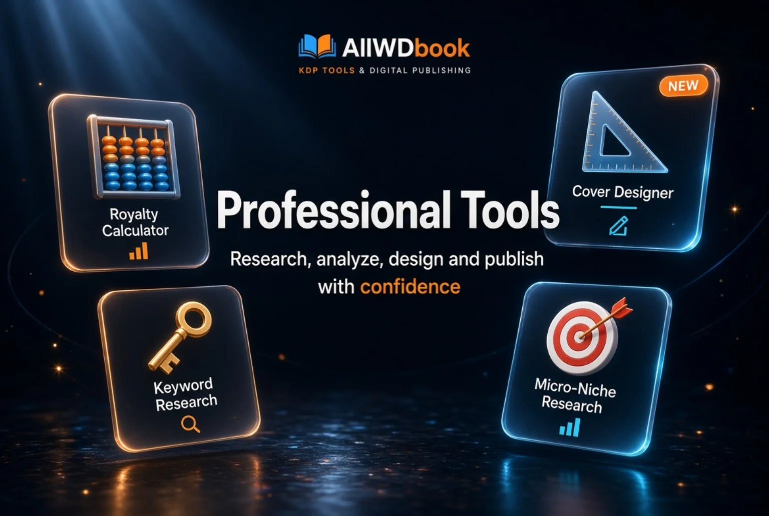
The image used for this article summarizes that idea visually. Royalty Calculator, Cover Designer, Keyword Research, and Micro-Niche Research serve different purposes, but they all appear as parts of AllWDbook.
The identity also has to work on mobile
It is relatively easy to create an impressive interface when there is a large screen available. The more difficult test comes when the same product needs to work within the width of a phone.
For AllWDbook, the goal was not to reproduce the desktop layout at a smaller size. The goal was to preserve the identity while rearranging the interface around the available space.
Buttons still need comfortable tap targets, headings need to remain strong without consuming the entire screen, and cards need to stack vertically when required.
Spacing is also part of the identity on mobile. If everything becomes crowded, the interface loses clarity regardless of how attractive the colors may be.
One identity in Arabic and English
Supporting both Arabic and English introduced another design challenge. Arabic runs right-to-left while English runs left-to-right, but the brand should still feel consistent in both versions.
The components therefore need to be flexible enough to reverse direction while preserving the same information hierarchy.
Text length also changes between languages. A button that comfortably fits an English label may need more room in Arabic, while another component may behave in the opposite way.
A bilingual design works best when neither language feels like a secondary version. The same identity should adapt naturally to both.
From a visual style to a system that can grow
As more tools are added to a platform, a consistent visual system becomes increasingly valuable. Without it, every new page requires a fresh set of design decisions.
With clear rules for colors, cards, buttons, headings, and spacing, new interfaces can be built more quickly while reducing accidental inconsistencies.
This also improves maintenance. If a certain type of button or card needs to be improved later, a shared system makes it easier to apply that improvement consistently rather than repairing each page individually.
In that sense, visual identity is not only useful for users. It also helps organize the process of developing the product.
What the AllWDbook identity taught us
The most important lesson is that a useful digital identity does not begin with the question, "Which colors look best?" It begins with the question, "How should the user experience the product while moving through it?"
Colors, logos, and typography matter, but they become much stronger when they operate inside a system built around clarity, navigation, and real usage.
For AllWDbook, the dark foundation, night navy, and orange accent became a way to connect multiple publishing tools and workflows inside one recognizable product.
The identity will continue to evolve. Every new page and every new tool is another test of whether the system can expand without losing the character that makes AllWDbook recognizable.